We are driven by curiosity. We have a penchant for seeking out new experience, original knowledge and candid feedback. Read this section for our thoughts, our insights, and a few opinions.
2006 Market Outlook
Key Points
- Economic and market risks definitely on the rise for 2006 – Inverted yield curve and abating liquidity portend slower growth – Energy remains a wild card
Performance in 2005
The two year period covering 2004 and 2005 was truly an exceptional one. For the more than 30 years that we have data, there has never been a two year stretch in which every major asset class has risen – except for 2004/05. Over this period, equities from Asia to North America to Europe to emerging markets as well as bonds in both developed and emerging markets rose as did commodities and real estate. The last time all asset classes rose in a single year was in 1985. For 2005, investors were lead by equities in the Far East (MSCI Far East +40%) and emerging markets (MSCI Emerging Markets + 28%), followed by European equities (MSCI Europe +20), commodities (Reuters/Jeffries CRB + 16%), emerging market bonds (MSCI EM +12 ), real estate and bonds in developed markets (US 10 year treasury + 3%).
The most notable winners were equities in emerging markets as Columbia, Egypt and Saudi Arabia each posted gains over 100% (local currency) while Russia, Turkey and Pakistan posted gains greater than 50%. Amongst developed markets Austria (55%), Japan (43%) and Switzerland (33%) were leaders. Within commodities markets, energy items were the biggest gainers with natural gas (83%) and crude oil (40%) leading the way followed by metals (copper, silver and platinum). Globally, real estate was a big winner with several nations, including the US, Britain, France, Spain and others experiencing double digits gains 1. Emerging market bonds saw gains with countries such as Brazil, Russia and Venezuela posting returns in the mid to low teens. By far, the most notable laggard was the US equity market which gained only 3%, as measured by the S&P 500 and was unable to outpace cash, which also rose 3%, government bonds (3%) or small cap stocks (Russell 2000 3%).
A Review of Canada
In Canada, the S&P TSX composite returned 24%; small caps, as measured by the TSX SCI, gained 9%; while bonds rose 4% and cash returned 2%. Within the broad TSX composite, the main driver of returns was energy names as the sector rose 61% followed by utilities at 34% and financials at 20%. Equities outpaced those in the US for the second year in a row and have continued a trend of out performance since the bursting of the tech bubble in 2000. In fact, as at year end, the TSX was within 1% of its all time high, set in Sept 2000, whereas the US, as measured by the S&P 500, remained more than 18% below its all time high set in March 2000.
Notwithstanding the obvious structural differences between the two countries, such as the very large US net debt and trade deficits versus Canada’s healthy surpluses, the main explanation for the out performance can be attributed to a rise in profitability levels of Canadian companies. As the graph below notes, for the past 20 years, Canadian firms have been consistently less profitable than comparable US firms. At their lowest point during the 90s, Canadian firms were 7% less profitable than their US counterparts. In the late 80s, profitability at Canadian firms approached parity with the US as gains were lead primarily by the rising materials sectors, though a rise in profitability amongst financials also contributed. In the late 70s, Canadian ROE (Return on Equity) surpassed the US and was driven primarily by precious metals and energy as each of oil, gold, silver and platinum rose by more than 100%.
S&P/TSX ROE net of core inflation less S&P 500 ROE net of core inflation
July 1974 to December 2005
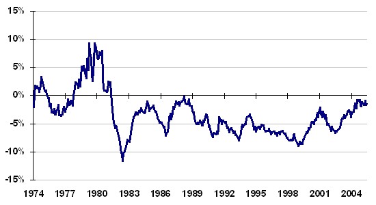
Over the past two years, the gap has again narrowed owing almost entirely to the energy sector. On average, energy names were providing a return on equity of 6% at the end of the 90s, compared to 18% today. Looking forward to 2006, the growth in forecast earnings for Q4 2005 and for the remainder of 2006 is so significant that ROE is expected to rise to 27%. As the graph below notes, the level of profitability in the energy sector leads all others by a wide margin. The next closest is financials at 18%, followed by information technology at 16%. By comparison, the US is much more balanced. Although energy again leads at 28%, health care at 26% and consumer discretionary at 22% are not that far behind. This skewness in Canada is simply another way to reflect the commodity bias and/or cyclical nature of Canadian markets.
S&P/TSX Return on Equity by Sector
January 2005, based on current year median estimates
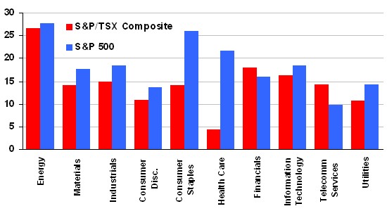
Source: Computerized Portfolio Management Services Inc.
Key Metrics: Valuations, Earnings Growth and Liquidity
In looking at equity valuations, our models indicate that markets are between neutral to fairly valued. Equity valuations as measured by the risk premium versus cash continue to look favorable mainly because cash rates, even though they have been rising, still remain low by historic standards. To measure the risk premium, we calculate the cash to yield ratio using cash rates as measured by the 90 day T-Bill and dividend yields as measured by the S&P/TSX composite. Cash rates today are at 3.4% and the dividend yield is at 1.5% for a cash to yield ratio of 2.3 times (3.4% divided by 1.5% = 2.3). Over the past 20 years, the average has been 2.5 times, with values greater than 3.5 times indicating that stocks are over valued. At the height of the tech mania, the ratio was at 6 times and heading into both the 1990 recession and the October 1987 correction, the ratio was at 4 times. Thus, at 2.3 times, the ratio remains below average and still trends towards the inexpensive range. This indicator is favorable for the US as well.
When measured against profitability, Canadian equities appear closer to fair value. For this metric, we compare the current market valuation as measured by price/book, against the current level of trailing profitability as measured by return on equity. According to our models, stocks should be trading at a price/book ratio of 2.5 given current profitability levels. They are currently closer to 3 times. At 3 times, stocks are fully pricing in all expected earnings growth to the end of 2006. Assuming that earnings hit their target for 2006, then a valuation of 3 times is reasonable. If stocks show signs of not achieving their earnings targets, then a multiple of 3 times is pricey and stocks will be exposed to a pullback as valuation levels adjust. A draw of 10% to 15% would realign valuations with current levels of profitability. Again, the skewness in valuation is being driven by the energy sector with a price/book ratio of 3.5 times. With the exception of technology, every other sector is below 3. This indicator is slightly more favourable for the US market since earnings have grown at a better than 15% clip while prices have risen only 3%. By this measure, US valuation levels have actually declined.
For Canada, a growing skewness towards energy ultimately equates to higher risk. A positive exposure to a growing sector is rewarding on the upside as it provides the portfolio with better than average returns. However, the opposite is true when the sector reverses course as it will then generate worse than average returns on the downside. This is essentially what happened during the late 90s when Nortel’s weight grew towards 40% in the index. At Nortel’s peak in August 2000, the one year return for the index was 63%, but without Nortel it was only 36%. One year later, following Nortel’s precipitous fall, the TSX was down 33%. Without Nortel, the index was down only 1%. For now, energy is not as large a weight in the index as Nortel was and the valuations of energy are not as inane as those of tech stocks in the late 90s. With energy prices currently around $60 to $70 / barrel it is difficult to be bearish on Canada, nonetheless, the indexes performance, good or bad, will be much more closely correlated to the price of energy as the sector’s weight within the index has risen from 8% in 1999 to 25% today.
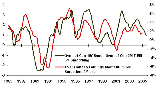
In looking at earnings growth, the biggest concern has been the rise in short term interest rates. With the rise in rates, the yield curve has now approached an inverted position, meaning that rates on the short end of the curve, as measured by 90 day T Bills, are now close to equal with those on the long end of the curve, as measured by 10 Year Government Bonds. An inverted yield curve portends slower growth. As the graph below notes, earnings growth tends to follow the shape of the yield curve, though with a reasonable lag.
Inverted Yield Curve
June 1985 to December 2005
Source: Computerized Portfolio Management Services Inc.
To calculate the level of inversion of the yield curve, we subtract the cash yield from the long bond yield. With long rates at 4.0% and cash rates at 3.4%, the spread is only 60 basis points, its narrowest level since early 2001. A level less than zero would indicate that the yield curve is inverted. The average spread is around 200 basis points. Generally, earnings growth will follow the shape of the yield curve but with a nine to twelve month lag as it takes some time for higher rates to affect and eventually slow down borrowing patterns, housing markets and/or corporate investment decisions. Earnings will be more responsive if the change in the yield curve is more dramatic as was the case from 1987 to 1990 on the way to inversion and then from 1990 to 1993 as the normal shape took hold. In the US, the spread is closer to zero, and notably an inverted yield curve has preceded every recession going back to the 60s. This includes recessions in 1960, 1969, 1973, 1980/81, 1990 and 2001.
Reported earnings for the past grew at around 10% in Canada, much slower than the above 30% rate from the previous three years. While analysts are forecasting that growth will reaccelerate and rise towards 24% for the year ahead, this seems unlikely given the shape of the curve, the bias towards possibly higher short rates and the latter stage of the economic cycle. Given the lag inherent in this indicator though, earnings do not have to fall immediately and can still grow at a more moderate pace, say 5% to 10%, and still be favorable for stocks as already high corporate profitability levels will be maintained. By itself, the current narrowness of the curve will not indicate a recession, unless the inversion becomes notably more negative or the flatness persists for a prolonged period of time. Though, we do think it noteworthy that many research houses and almost every forecaster that we follow have argued that this time is different in that earnings will not be sensitive to the yield curve. We disagree. At best, this indicator is neutral with a trend toward negative.
On the liquidity front, the picture is notably more mixed. While the US Federal Reserve has started to turn off the liquidity tap, the remaining major central banks have not. By our measure of local currency liquidity, the Euro zone is effectively at 25 year highs, the UK is at 15 year highs and Canada remains at 20 year highs. Only the Japanese have maintained stable liquidity with levels around their longer term average. The US is now below its average of the past 10 years and far below the levels seen during the 2001 to 2004 period. The elevated levels of liquidity are certainly the easiest explanation for why all major asset classes rose in tandem over the past two year period. In particular, with so much excess liquidity in the system, investors had little fear in seeking returns from higher risk assets such as emerging markets and emerging market bonds, both of which were among the top performers. But, in aggregate, the excess liquidity is significantly lower today that over the past two year period. In particular, global liquidity, when measured in US dollars, does give a much different picture.
From a global US dollar perspective, liquidity clearly peaked in 2003/04 as it reached its highest level since the mid 1980s. Since then, owing to the rise in short term rates and to the rise in the US dollar against the major currencies, it has now contracted towards below average levels. (See graph below). This dichotomy between the US dollar liquidity and local currency liquidity will probably be the most significant factor in determining how asset prices perform for 2006. Depending on how you measure it, liquidity is either contracting or its supplier has simply shifted and is now located in Europe instead of the US as in aggregate the Euro zone and the UK are roughly equivalent in monetary size to the US.
G7 Aggregate Liquidity (in US dollars)
January 1984 to December 2005
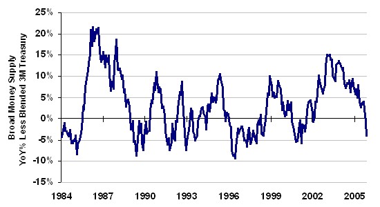
Source: Bank of Canada, US Federal Reserve, Bank of England, European Central Bank, Bank of Japan
The Road Ahead
After a very strong 2004 and 2005, the path for 2006 appears more challenging. In assessing our key metrics, we note that equity markets are most sensitive to liquidity in the near term (meaning less than one year); to valuations, yield curve inversions and earnings in the mid term (meaning one to two years); and profitability over the longer term (more than three years). Canadian liquidity levels are at extreme highs, but the US are not. Valuation levels are neutral to fair, whereas profit levels are very high but being driven largely by the energy sector. Earnings appear poised to head lower, though the exposure to energy does act as a wildcard independent from domestic events.
The downside of such a large skewness is that it leads to a greater concentration of holdings, produces a less diversified portfolio and ultimately a riskier portfolio. So as goes the energy markets, so goes the Canadian index.
On a closing note, one other trend that we are following closely is the rise level of correlations amongst asset classes. While the rising correlations among global equity markets have been in evidence since the 1980/90s, the link amongst asset classes is a more recent phenomenon, driven in part by the growth of hedge funds and increases in asset crossover strategies. As observed during the Asian currency crises in 1997, the Russian debt default in 1998, and the credit derivative stress of 2004, negative events in other asset markets quickly affected equity markets in North America. That said, while we do not see immediate risks within the equity sphere, we are closely monitoring debt levels in the bond markets, credit spreads in emerging markets and energy and gold prices for early warning signs that could indicate adverse events for equities. Until we see a weakening in these areas, we remain neutral about prospects for equity markets, but admit that they face a slightly more arduous trek in the latter stages of this current cycle.
Conclusion
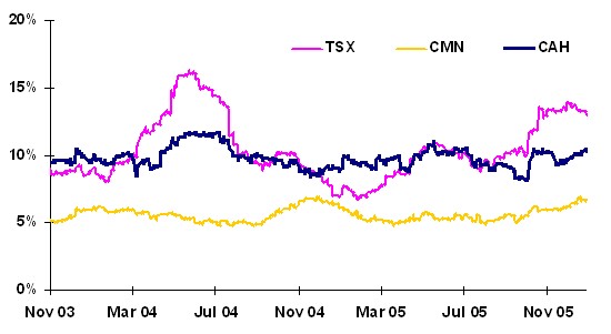
In recent Hillsdale publications, we have discussed the benefits of risk budgeting and the ability of Hillsdale to manage strategies to specific risk and return objectives. With increasing volatility and a narrowing of breadth in the Canadian market, it may be a good time to review the current risk level of your portfolio. Our Canadian and US Aggressive Hedged Equity products are designed with a risk budget similar to a balanced fund, targeting a volatility level in the 10-12% range, while our Canadian Market Neutral Equity fund rivals bonds, with a 6-8% volatility target. The graph below illustrates how Hillsdale has successfully managed its strategies to meet their stated risk objectives as compared to the market which has had a more variable risk profile. As always, please do not hesitate to contact Chris Guthrie at 416-913-3924, Arun Kaul at 416-913-3916, John Loeprich at 416-913-3922, or John Motherwell at 416-913-3923 at any time if you are concerned or curious about the current risk level of your portfolio.
Volatility vs TSX – 60 Day Rolling
November 2003 to December 2005
Regards,
Chris Guthrie and Arun Kaul
Footnotes:
1. The Economist, The Economist’s house price indices (as at Q3, 2005), December 8, 2005
